The Tom and Jerry Show
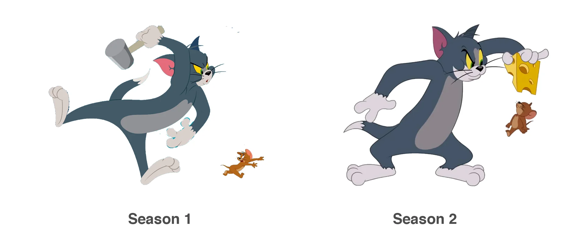
After Season 1 of The Tom and Jerry Show, a new chapter in the classic franchise, the teams at Warner Bros. and Renegade Animation aimed to refine the show’s visual style and improve production workflows. There was interest in bringing the characters closer to their classic appeal and enhancing the overall quality.
I joined the team during the Season 2 revamp to help rework the production process. Over time, I moved into a supervisory role that included character and prop design, asset management, and coordinating both in-house and freelance artists..
The goal was to refresh the visual style to feel both classic and modern, while maintaining a Flash-based production pipeline.
Cleanup & Rigging
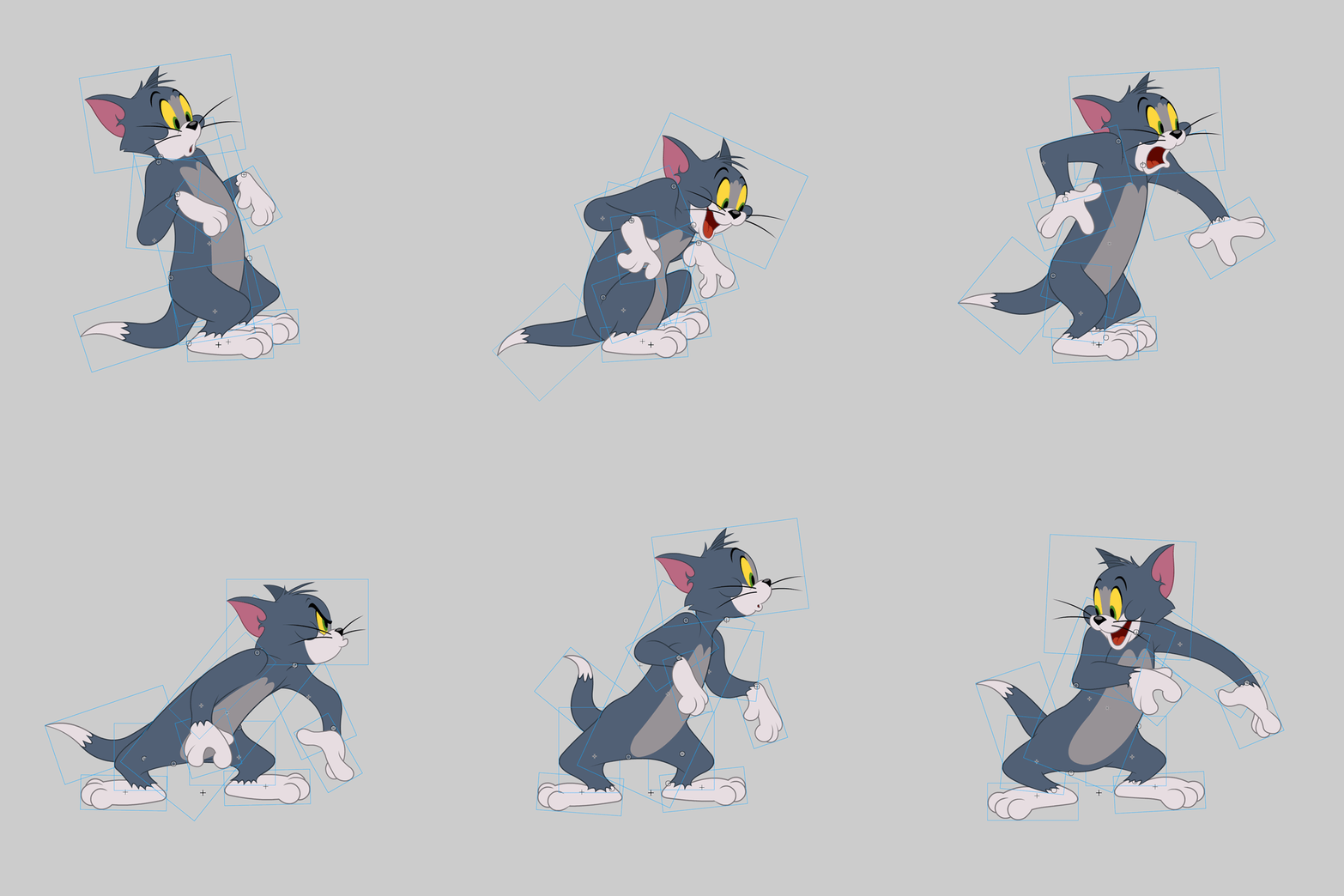
I initially joined the team to support the technical side of production, focusing on cleanup and character rigging. At the time, the art file organization and pipeline lacked structure, so with the help of other technical leads, I developed systems to streamline and standardize the workflow over time.
Cleanup: I refined storyboard panels to ensure characters were on-model, with clean linework, proper line weight, and accurate color—down to the scene-specific lighting. I later scaled this quality control process for the entire art team.
Top: Daytime Rig Bottom: Nighttime Rig
A prop design template I created to ensure the proper sizing of a prop relative to character heights, as well as color and line weight.
Character Design
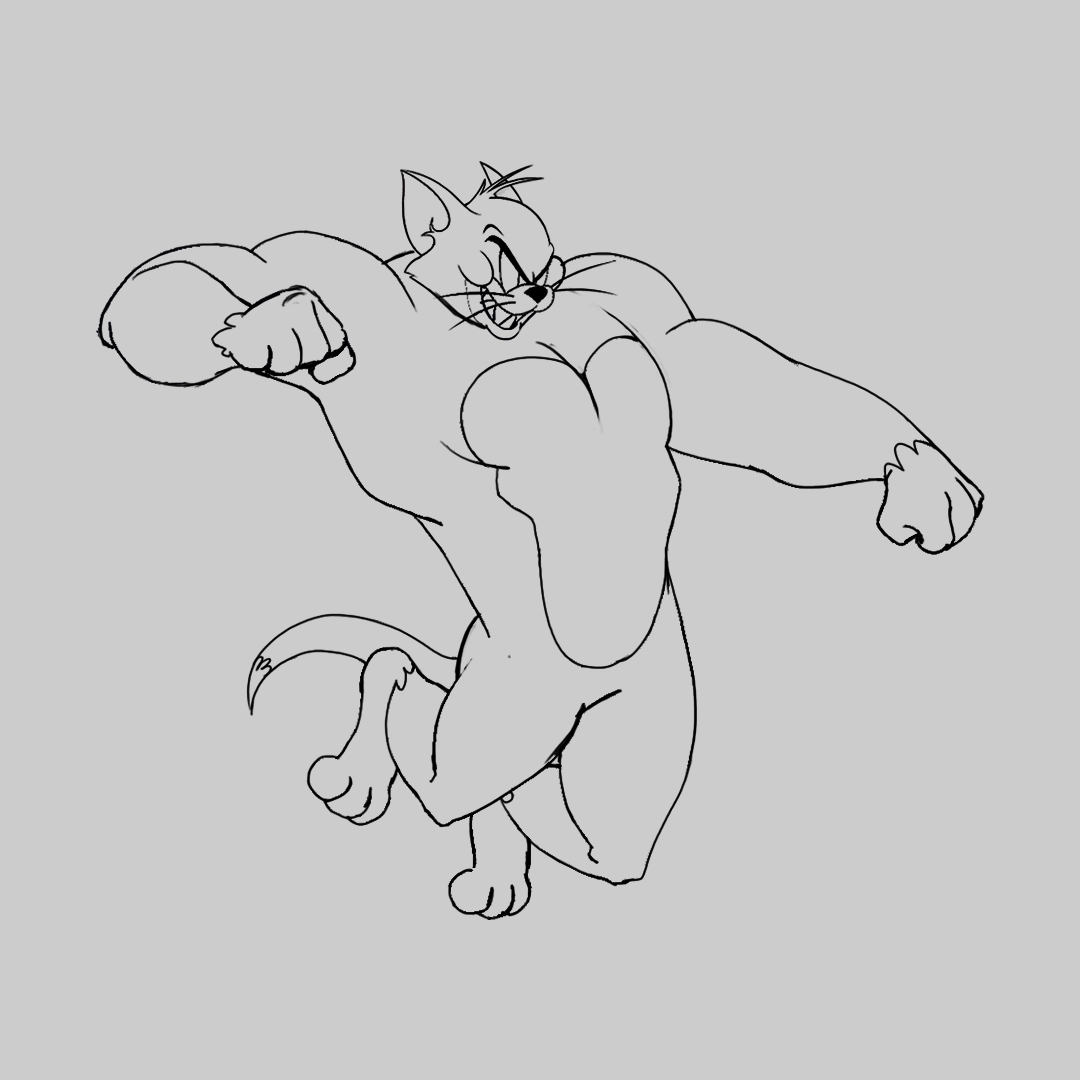
Once the technical pipeline was running efficiently, I was given more responsibility over the brand's visual direction. This led to a transition into character and concept design. Here are a few of my favorite concepts from that period.


